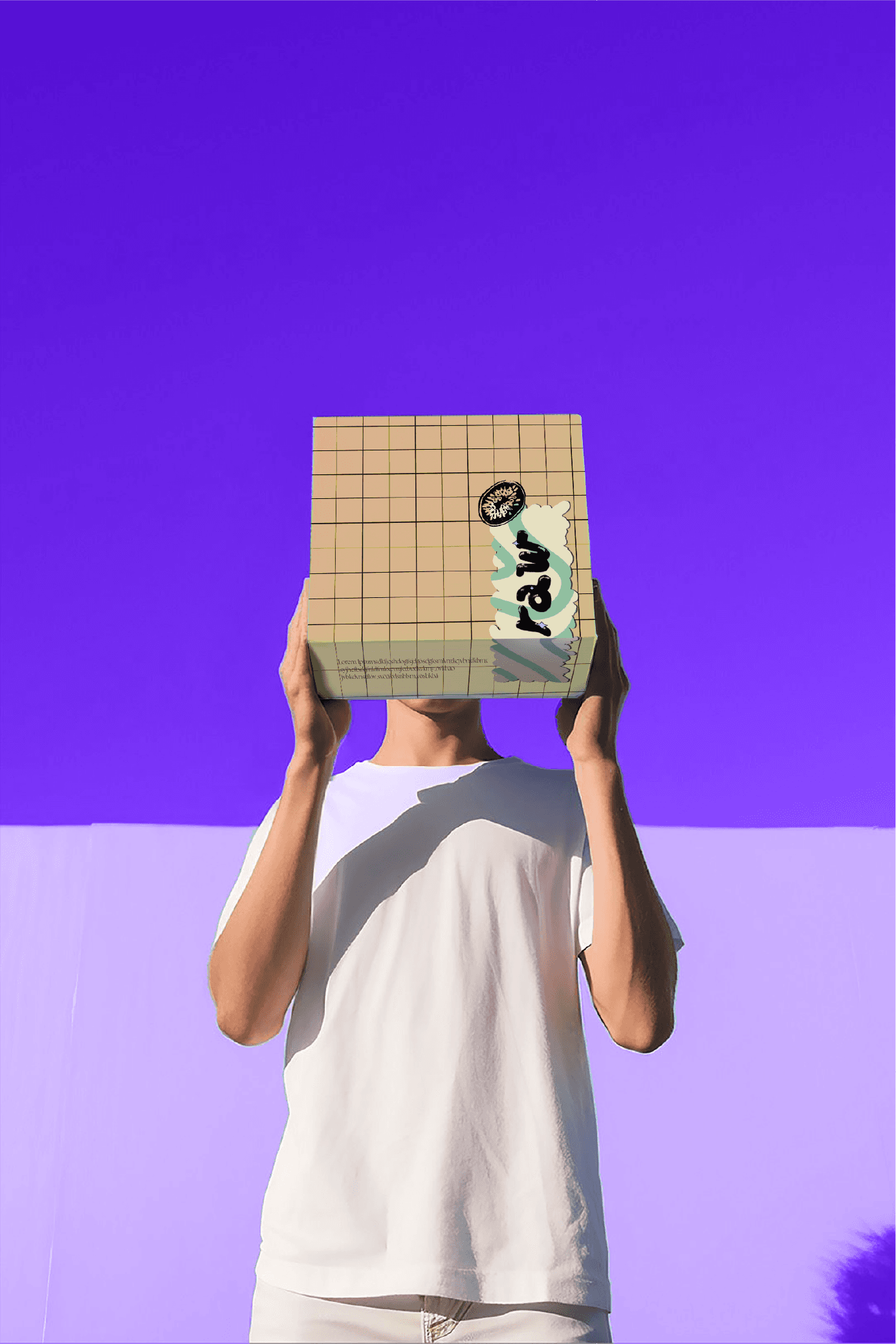
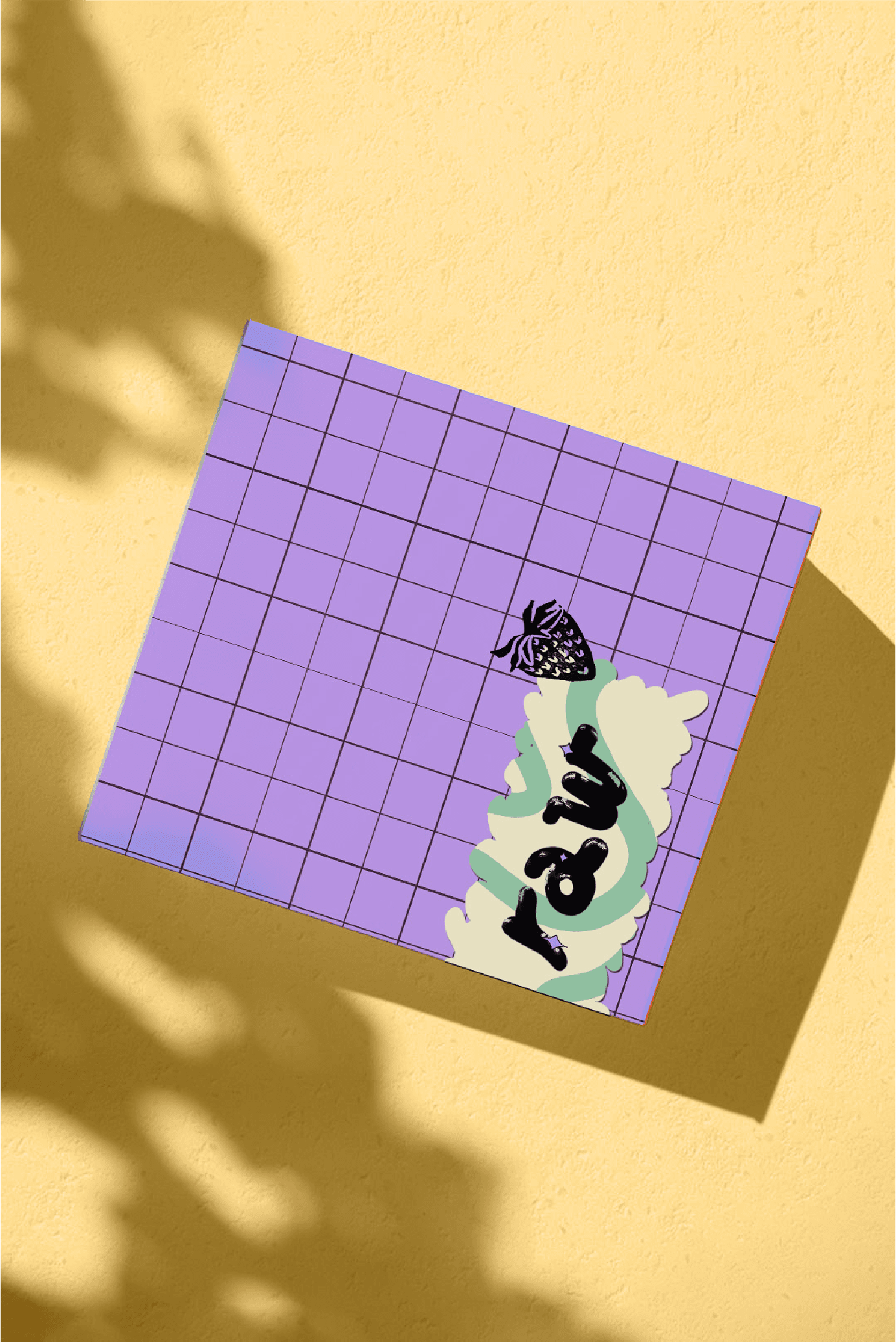
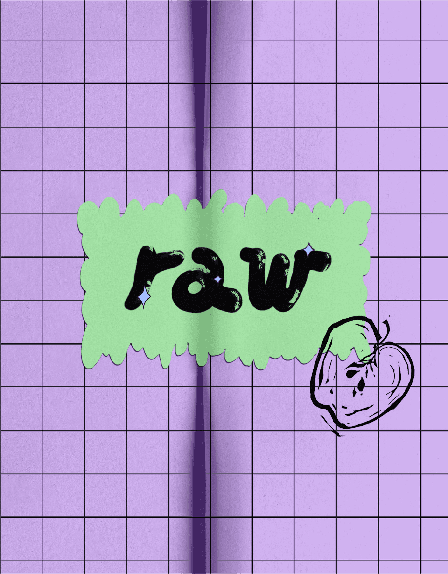
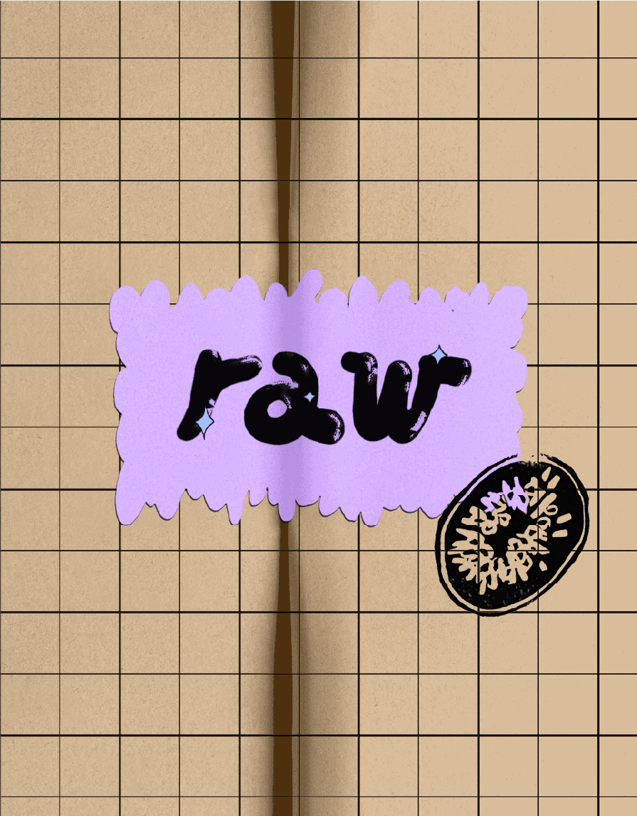
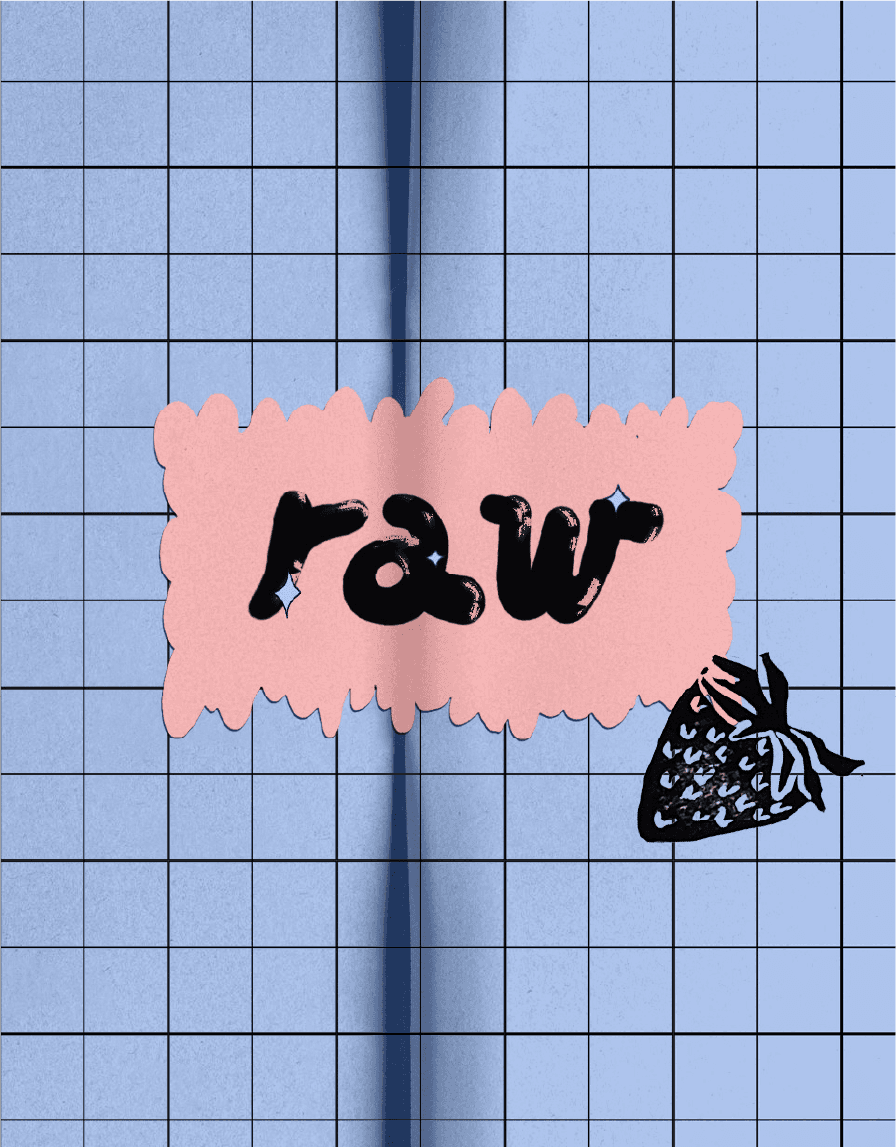
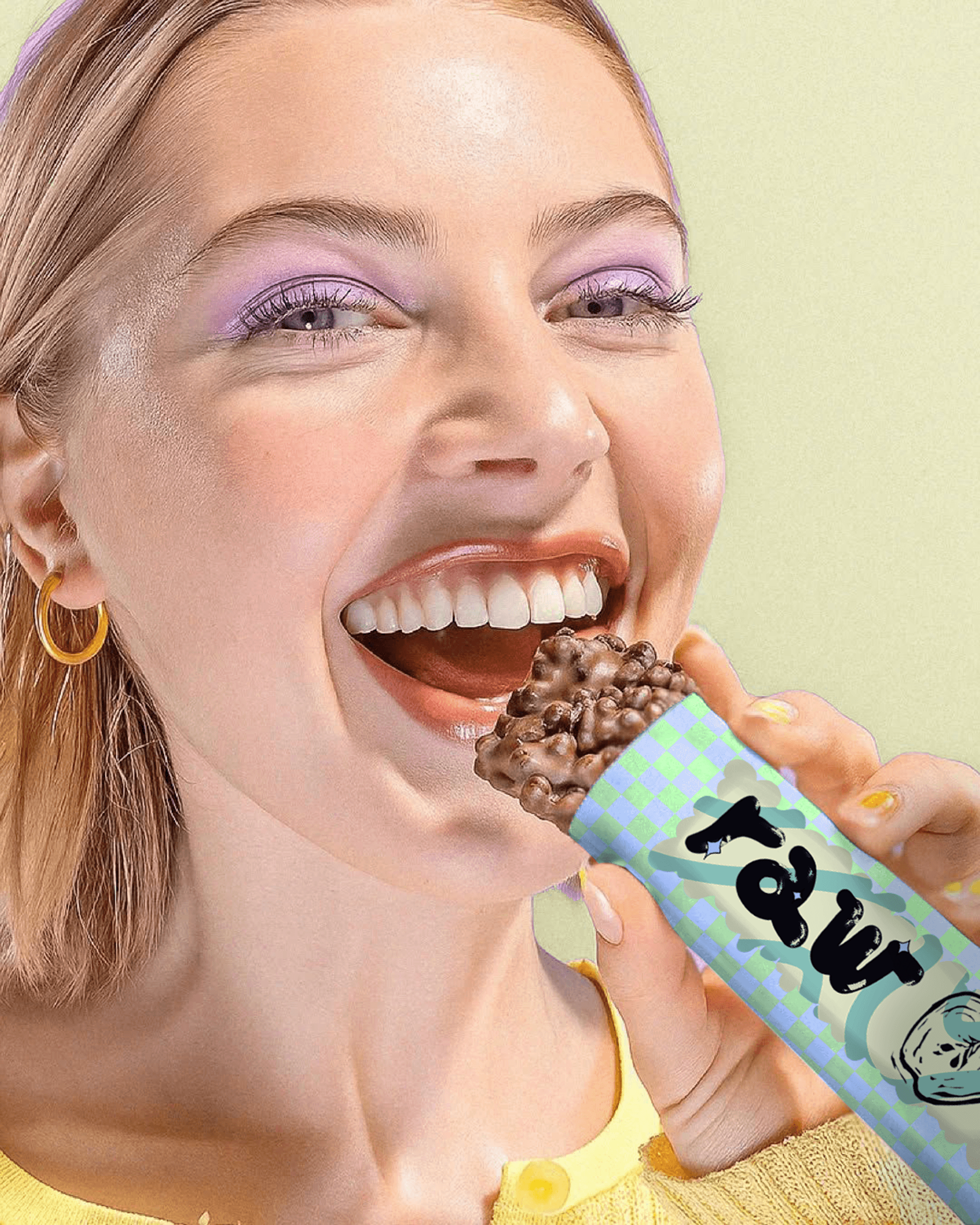
Raw
This project began by defining what raw means visually and conceptually. Through a hands on, detail driven process, the packaging identity came together.
Role: Branding / Motion
Date: May, 2025
Slowing down to notice.
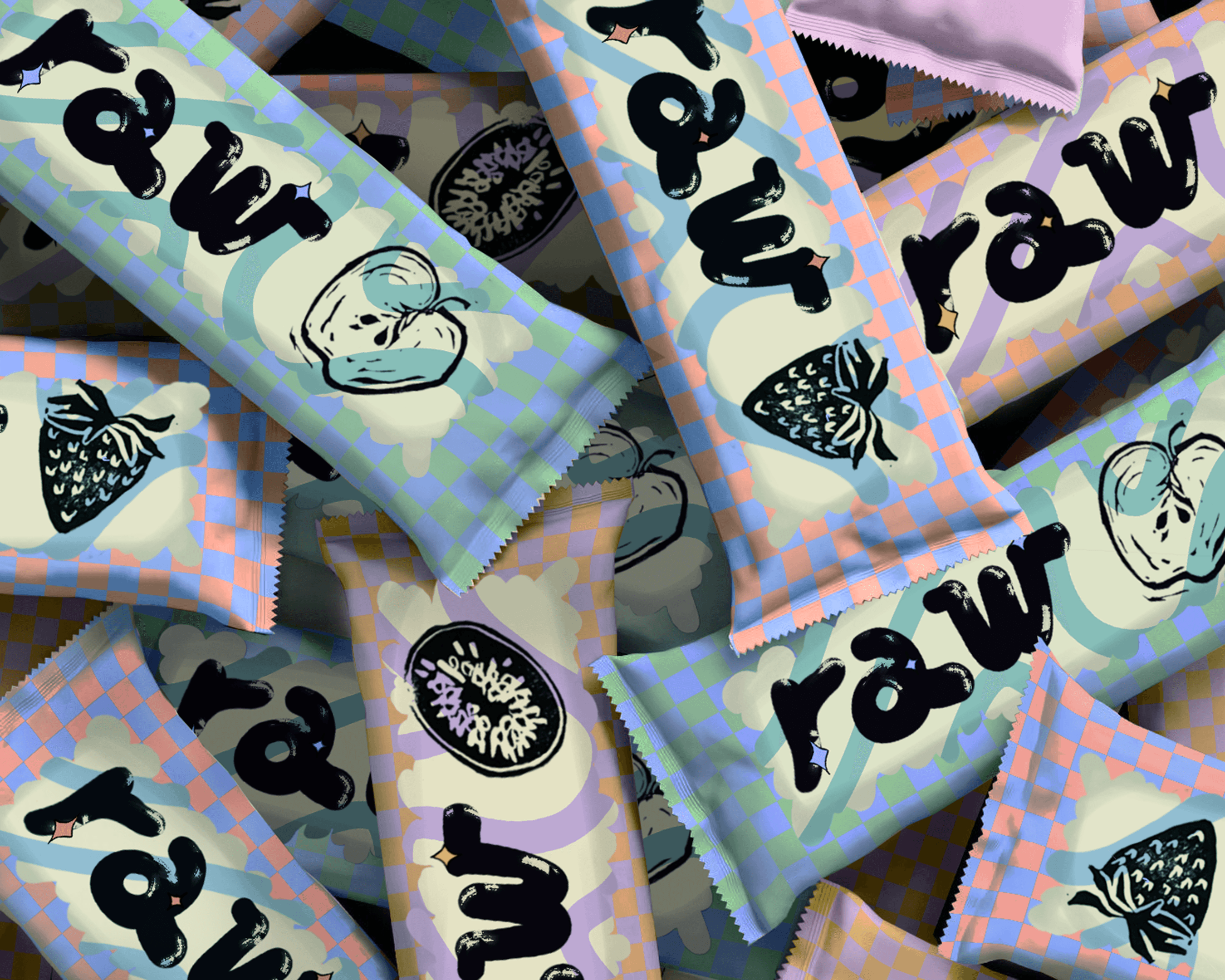
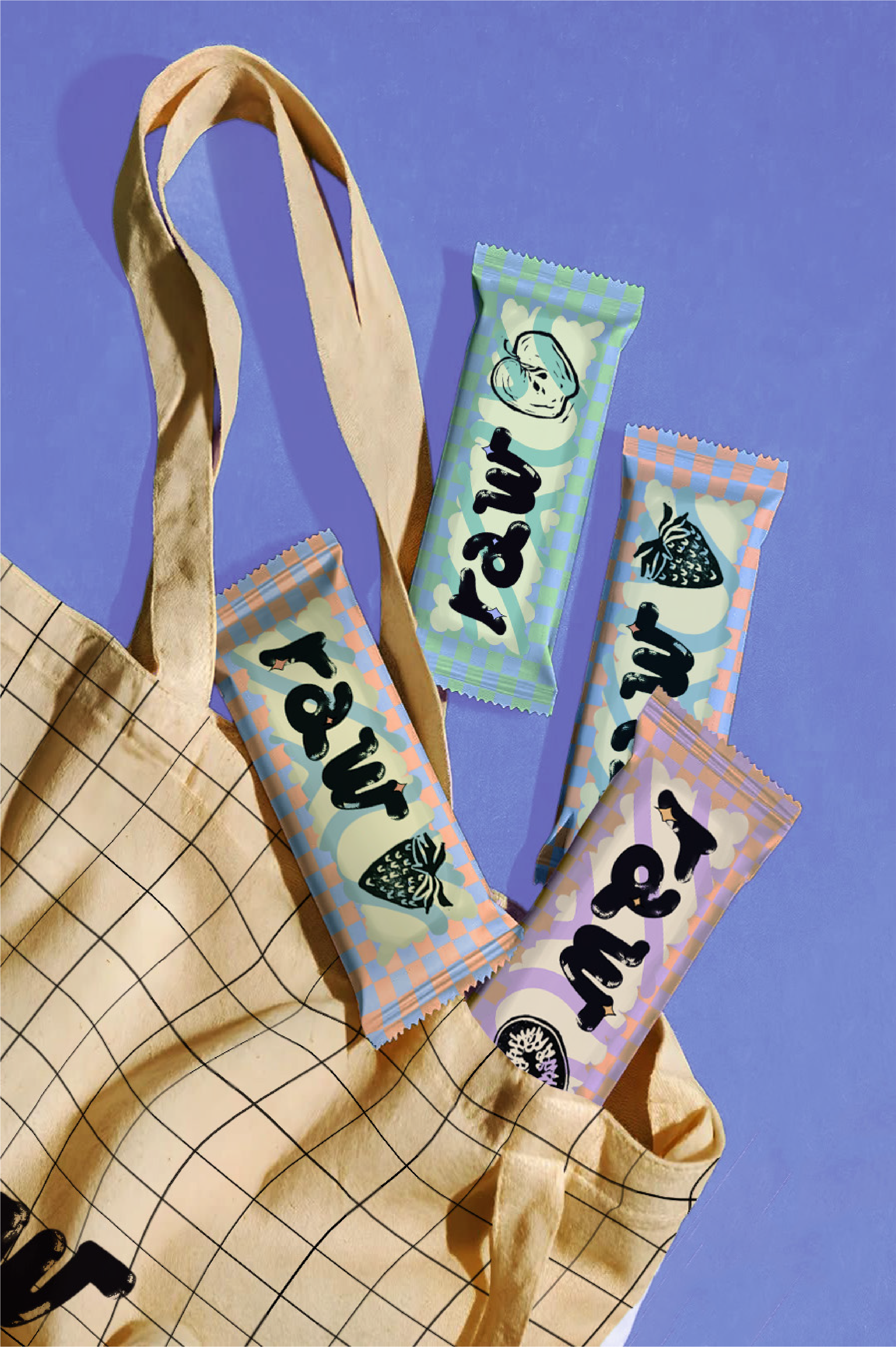
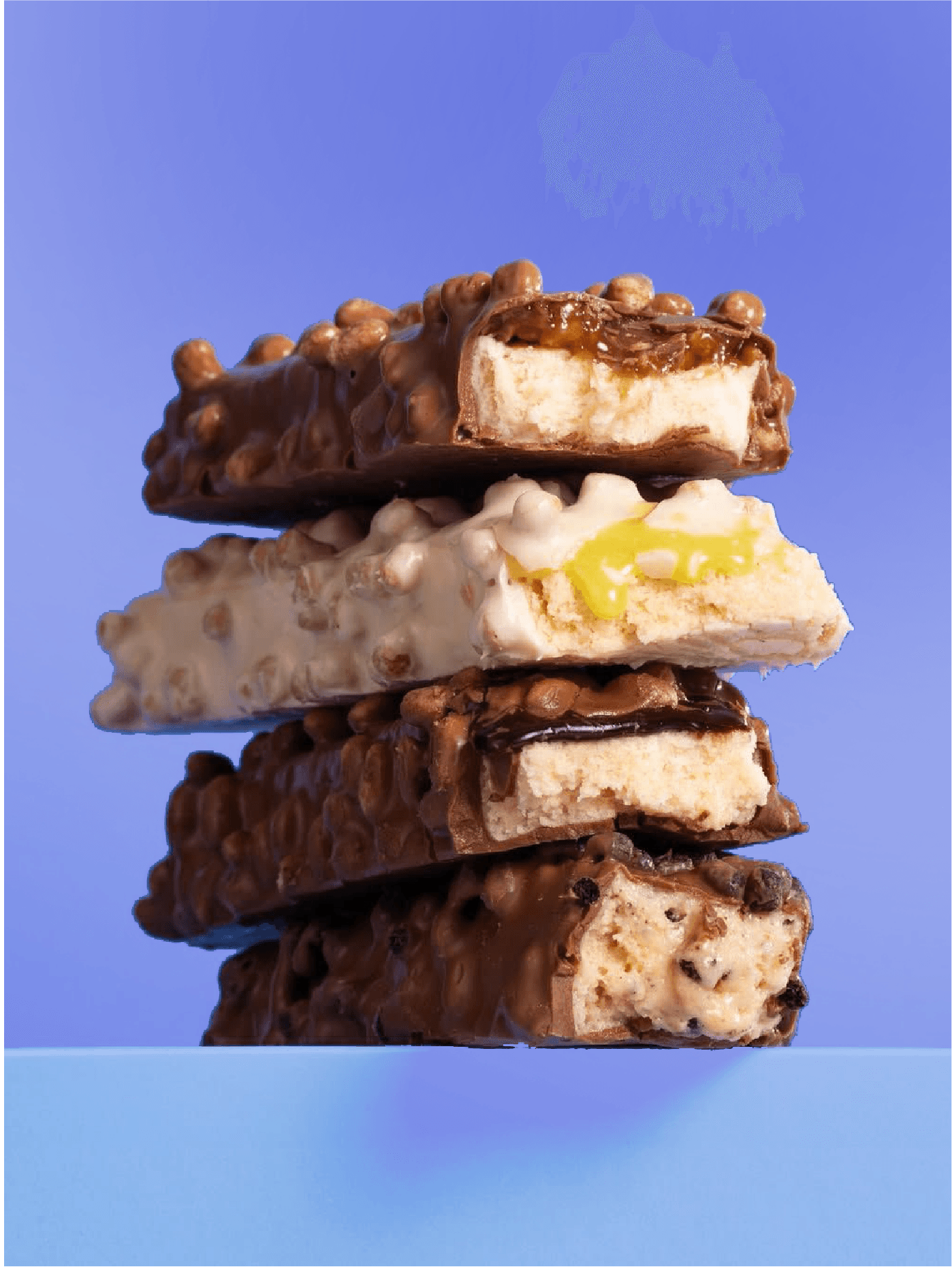
I approached this protein bar packaging as an exploration of rawness in process, texture, and intention.
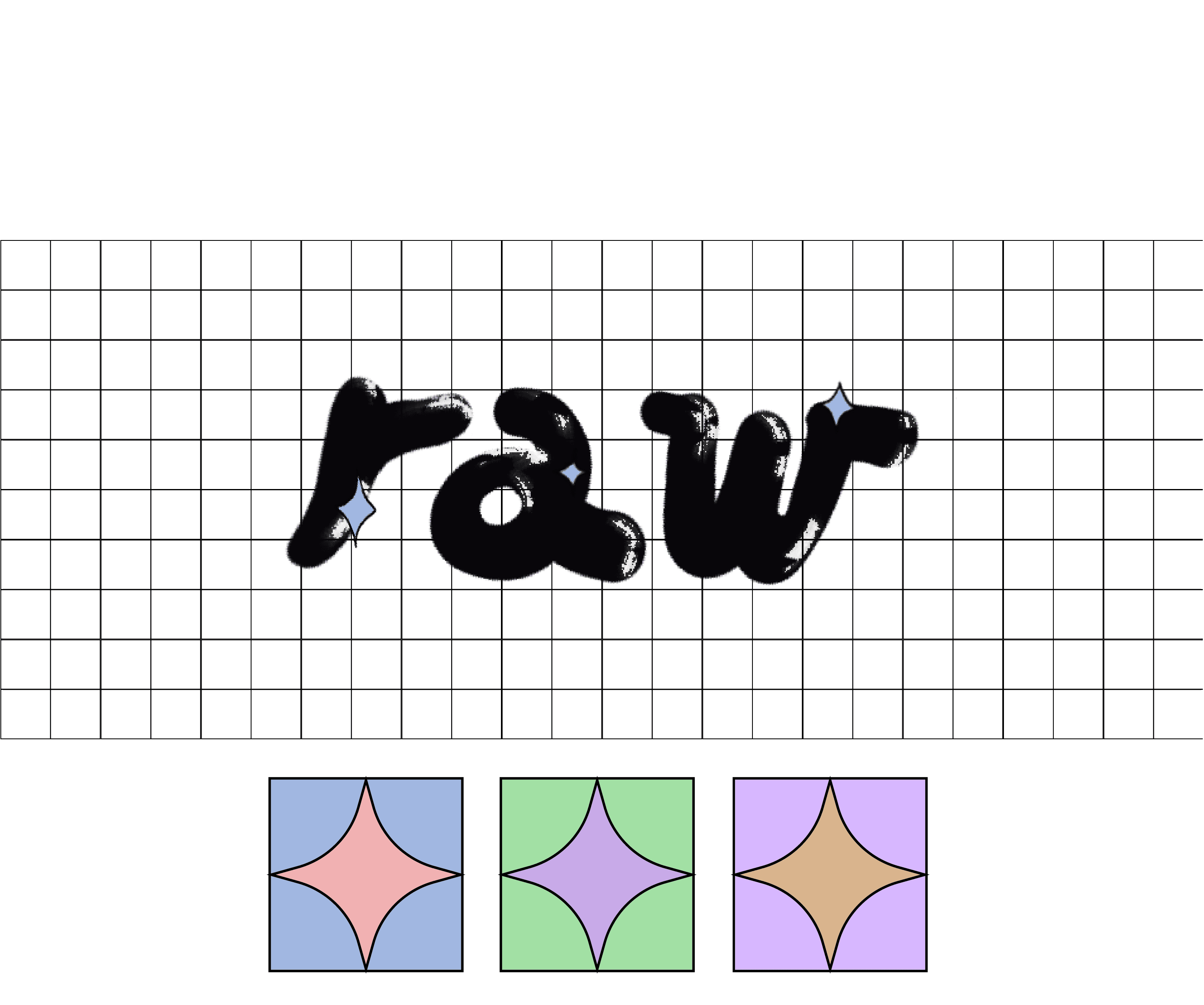
In a fast paced world built on shortcuts and copy paste solutions, I wanted to slow things down and create a truly raw experience by filling every little square one by one. No automation, no shortcuts. Just honest, hands-on work.
Crafting a raw, authentic feel.
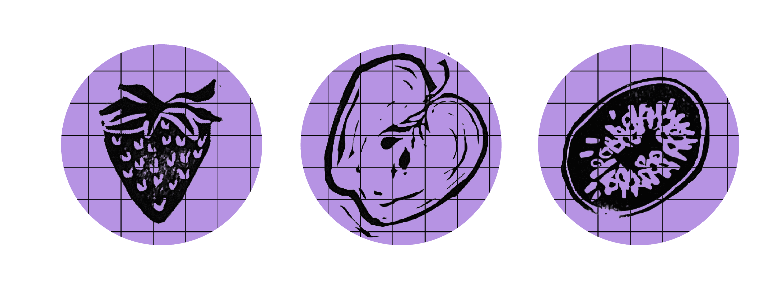
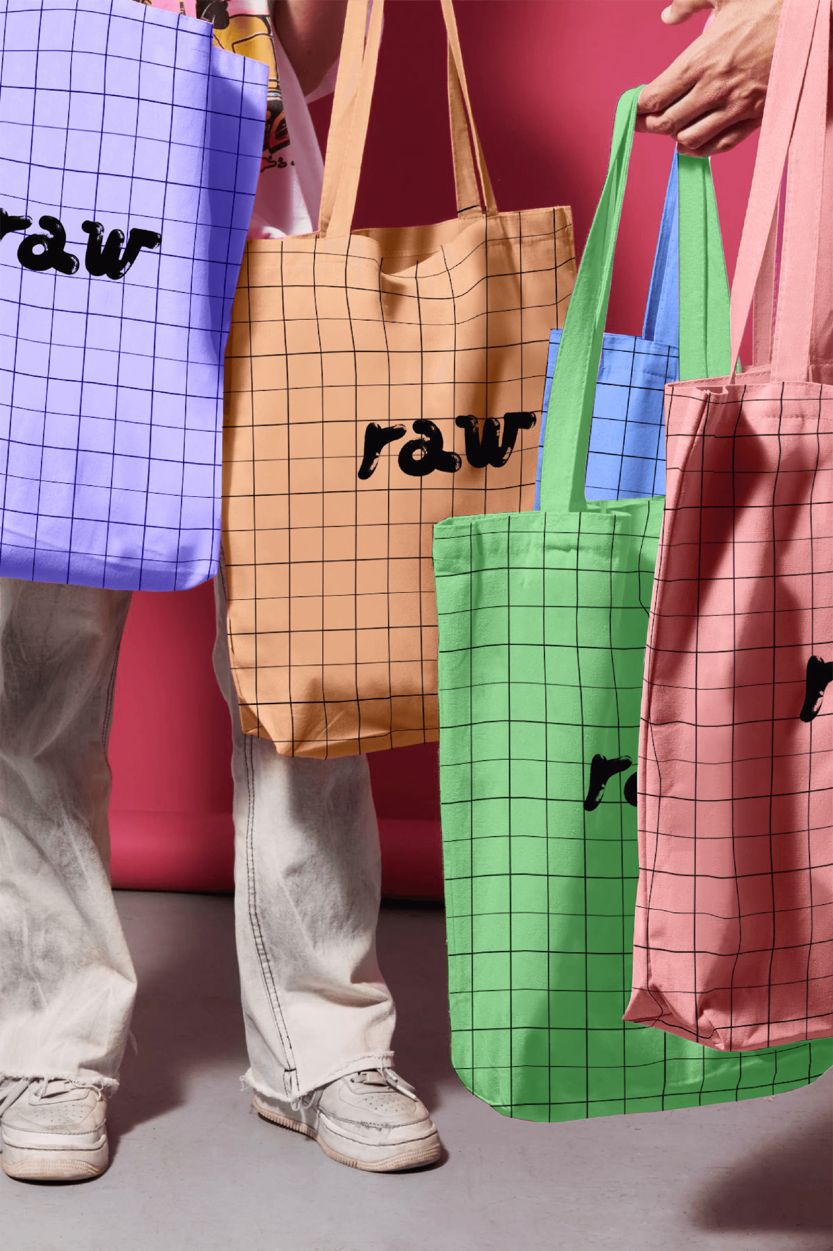
The concept embraces imperfection as a strength: authentic, imperfectly perfect, as raw as it gets. The name RAW itself is crafted using a linocut print effect, celebrating irregularity, texture, and the beauty of human touch. From typography to composition, everything is intentionally unpolished designed to feel real, free, and honest. Stay raw, stay free. We like it raw.